Websites today are getting easier and easier for the average user to create.
You don’t even have to be a programmer or web developer to see a website come to fruition. Some website-building services don’t even require you to know a lick of code in order to launch a new site. You can just pick a design template, drag and drop content, write a little copy, and then it’s up and live in a matter of minutes.
Because of the low level of technical skill, you’d think such a site would look pretty basic. However, some of these properties actually look pretty good on the surface, boasting modern layouts and large, high-quality images. And that’s a good portion of the battle right there when it comes to having a successful web presence.
While it’s nice to be able to put up a presentable site quickly for your customers or just anyone following you closely, these types of websites struggle with long-term growth. Such a shortcut can only get you so far.
When it comes to complying with the latest SEO developments, most easy website builders get left behind – or at best take months or years to catch up. Let’s take a look at why codeless website builders like Wix, Muse, Weebly and similar services aren’t built to help businesses scale.
How Easy Website Builders Struggle with SEO
If you’re using your website to try to reach new markets and build your clientele, using a codeless website builder is going to make that task difficult for you. This is because it’s going to be a battle to get (and keep) any page from your website to show up on the first page of search results.
Even though these easy website builders allow you to type in your own meta tags for each page, and they offer proprietary SEO-related plugins, they still fall short in many ways when it comes to helping your rank higher in search.
Here’s why:
Poor URL Categorization and Structure
When you’re organizing the navigation of your website, it’s best to keep the URLs of your main categories and sub-categories clean and succinct. The homepage and the main menu items are all considered Tier 1 pages. If you have any categories that have drop-down options beneath, those are Tier 2 pages.
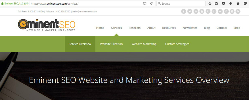
In short, it’s best to not have any Tier 2, 3, etc. pages branching right off the homepage, URL-wise. For examples, for our site you will see the URL of our Services pages as https://www.eminentseo.com/services/. We then have three Tier 2 options (not counting Service Overview) that stem from our Services page (and even some Tier 3 pages not shown in the main navigation).

If you visit our Website Creation page, you’ll see this URL:

It’s very important to have the main page of the “silo” in the URL before “website-creation/.” Otherwise, everything just looks like it branches off from the homepage, and Google’s web crawlers will have trouble understanding how your site flows and which pages deserve more emphasis than others.
With a Wix-created website, any page other than the homepage starts with a “#!” (sometimes referred to as a hashbang) right after the main address. Not only does this make for a messy URL, but it looks to Google like every page is just a direct extension of the homepage. Thus, it’s going to be hard for the website to rank for any of its Tier 2 or 3 pages – unless you search for the site name and specific service directly.
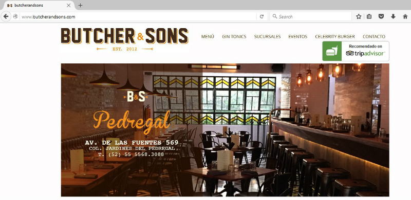
For example, we’ll look at one of the featured Wix sites: Butcher & Sons, a restaurant chain in Mexico.

This site has a main menu category called “Sucursales,” which basically means “branches” or “locations” in English. The URL for the Sucursales page is:

And if you click on any of the six drop-down items under the Sucursales category, the URL will be structured as such:

Notice how the top-level category, Sucursales, is disregarded when it comes to these Tier 2 pages.
Not good. And that’s no fault of Butcher & Sons.
With Tier 2 items branching right off the homepage, it’s like telling Google that all Tier 1 and 2 content is equally valuable. And for most websites, this is not the case.
As for Weebly and Adobe Muse websites, they don’t suffer from having hashbangs show up in their addresses, although many sites contain URLs ending in “.html” for their non-homepage content. This isn’t necessarily an SEO-killer, but it makes the URL longer and less eye-appealing. The best practice is to end your URLs like such: “services/.” Yes, ending with a forward slash is ideal.
Weebly sites appear to not be able to structure URLs optimally either. Tier 2 pages all seem to stem right off the home address. As for Muse, I had trouble going through its “Site of the Day” list and finding any website that even had Tier 2 pages visible from the main menu. Many of them had a menu that just directed to an anchored section of the homepage below the fold. In fact, I only found 2 out of the first 16 featured sites that had navigation that went deeper than the first tier. And when I did find such a site, all Tier 2 pages, you guessed it, branched right off from the home address. Tsk tsk.
Excessive Code
With the rise of codeless website platforms, many web developers noticed that excessive code was needed in order to make creating a website easier, particularly in Muse. In other words, lines and lines of code were used to offset the user’s lack of HTML knowledge.
Excessive code often leads to slow loading times, especially in the ever-growing world of mobile search. Slow loading times means many visitors will bounce, rather than wait for the entire page to load. Both slow loading times and high bounce rates cause rankings to suffer in Google Search.
Such issues are no fault of the codeless website creators, who run the risk of losing eyeballs and leads because of long loading times and decreased visibility in search. In fact, their content pages will have a hard time ranking in the first place, because search engine crawlers often have difficulty sifting through all of the extra code and figuring out what each page is about.
SSL Certificate Difficulty
If you’d like to upgrade the security of your website, obtaining an SSL certificate can be problematic with Weebly and impossible with Wix. SSL certificates create trust with your visitors and customers, and they’re projected to become a ranking factor in Google Search in the near future.
More on SSL certificates here.
With a Wix-created website, you actually don’t own your own content. They do. And since they basically own your website, you can’t add an SSL certificate whatsoever.
If you decide to add Wix’s shopping cart to your website, that will be SSL-protected, but otherwise, you’re out of luck with adding a site-wide security certificate. I’ll further explain the pitfalls of not being the sole proprietor of your website in a moment.
Weebly and Muse both allow you to add an SSL certificate to your domain, with some stipulations.
- Weebly highly encourages you to purchase your SSL certificate through them. However, what they offer isn’t among the strongest types of such certificates on the market.
- For an SSL certificate on a Muse-created site, you’ll have to go through your website host and a third party.
From looking through the featured websites on Weebly and Muse, it’s noticeable that most site owners aren’t utilizing an SSL certificate. Perhaps quite a few in the bunch don’t even know what an SSL certificate is – speculation of course.
You’re Not in Full Control of Your Content and Website
With Wix, you’re actually not in sole control of your own website. It may appear that way, but that’s all smoke and mirrors. While Wix’s Terms of Use says that you own all rights to any content you upload to your site, there’s this stipulation:
This means Wix can modify the content on your site, remove it, or even feature or reuse it elsewhere. Your entire site could even be included on the platform’s featured websites page. But what if you don’t want to shout to the world that you’re using the Wix platform?

Other codeless website builders don’t infringe on your submitted content as deeply as Wix does, but they still retain to right to move or delete your material, especially if it’s copyright-protected, indecent or spammy. These platforms make it clear that you’re on your own if material you upload gets you into legal trouble.
Also, if you try to move your codeless-created website over to another content management system, it’s going to be difficult, if not impossible. With Wix, you can pretty much just copy and paste what you have, but you can’t download a page into a file that can be uploaded elsewhere.
As far as all Wix, Weebly and similar codeless website builders go, don’t even think about taking any of their graphics, templates, proprietary stock images, etc. over to another site. Only your original content can be taken and reused if you decide to create a website elsewhere.
The Times When Codeless Website Builders Can Work
Looking over the featured websites on Wix, Weebly and Muse, I see a lot of small restaurants, web design agencies, architecture firms and individual actors, pastors, public speakers, local bands and the like. Basically, these sites are like a slightly bigger about.me page.
You can think of a codeless-created website like a starter home. It’s affordable, it’s manageable, it works for the time being, and it allows you to get a sense of what you like and don’t like before you upgrade your space down the road. It’s also better than not having any site at all when it comes to handing out business cards or imploring your social media followers to visit your personal online space.
Like I mentioned earlier, many of the sites created this way actually look pretty good, as they are heavy on the visuals. Most codeless website builders even support shopping cart integration, so you can get a small ecommerce business off the ground. Overall, these types of sites are decent if you’re a one-person business or a startup with no coding experience and a tight budget.
Other popular easy website builders that require little to no coding include:
- SiteBuilder.com
- WebsiteBuilder.com
- Web.com
- Webs.com
- Sitey.com
- Sitelio.com
- eHost.com
- Squarespace.com
But You Want to Grow, Don’t You?
If you want to use your website as a means to help your business grow, relying on a codeless-built site is going to make that mission difficult. This is because an SEO strategy is hard to execute with these platforms. You saw that not only does Wix produce messy URLs, but Weebly and Muse both struggle with proper URL structure. That’s just one of many drawbacks.
Although Wix had the most minuses in the SEO analysis above, a common theme among all easy website builders is they seem to lag behind when it comes to Google’s changing standards, such as algorithm updates and ranking factors.
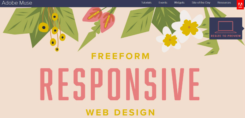
For example, Wix and Weebly didn’t jump into the responsive design game until somewhere between late 2014 and early 2015. Adobe Muse’s homepage didn’t tout the platform’s responsive capabilities until late 2015, and it still advertises this feature like it’s a new thing.

Your best bet at long-term growth is to find a digital marketing company that can not only create and host your website, but also implement a sound SEO strategy so your content ranks high in the search results. Eminent SEO has a team that excels in these and related strategies in order to help clients large and small succeed with their online presence. Click to learn more about our Website Creation services, or call 800.871.4130 today.
The post How Easy Website Builders like Wix, Muse and Weebly Hurt Your SEO and Growth Efforts appeared first on Eminent SEO.

